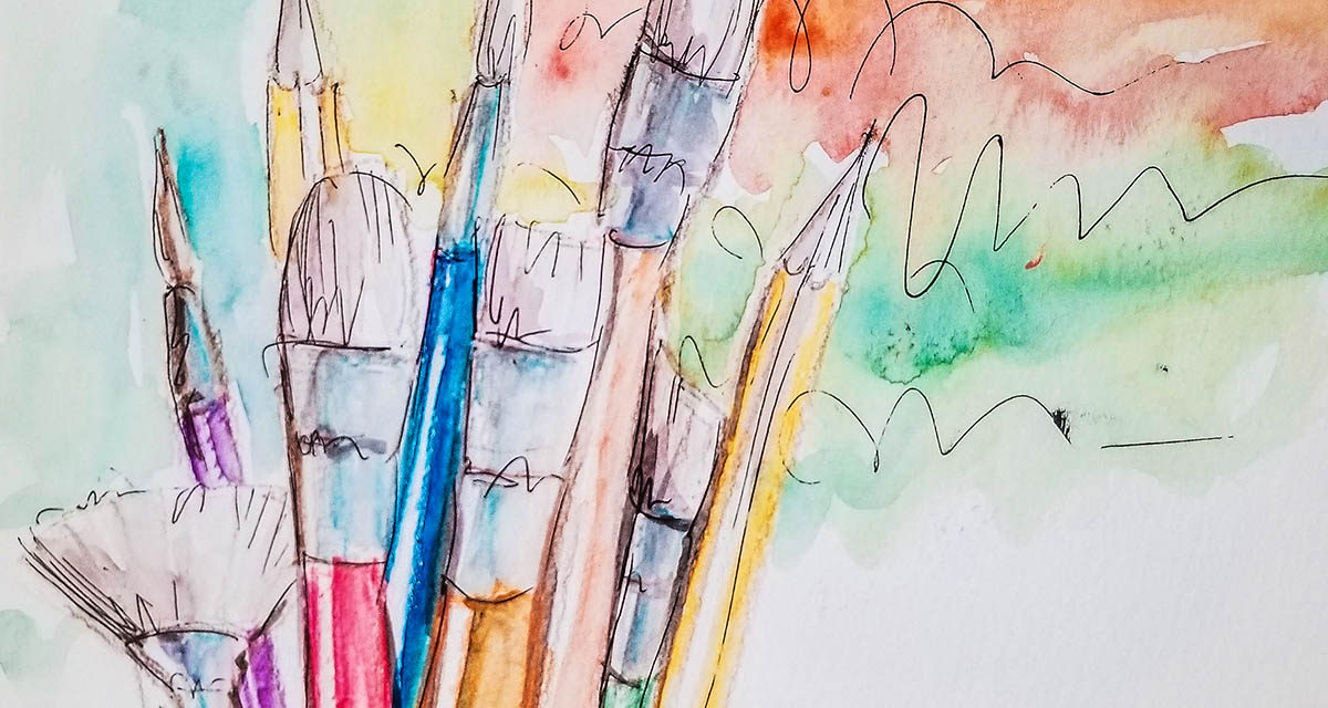
Looking for watercolor painting ideas or want to sharpen your painting techniques? This post will answer many of your questions.
Watercolor is one of the most alluring media in the art field. It helps portray soft, spilling hues of the breathtaking paintings of the skies and seas, as well as dreamy, earthy shades of the portraits.
From vibrant to muted, watercolors make everything look incredible, mystic, and soothing. Watercolor painting is also tricky in a way because it seems very easy to handle in comparison to oil painting or others. But in fact, they are one of the most complex media to master.
I always loved watercolors ever since I was interested in art. I always wanted to paint those imaginary and dreamy paintings.
After finally giving it a try and failing miserably, I gave up on it for a good, long while. I resolved to only admiring the watercolor masterpieces of other painters. It was up until I decided to take a basic watercolor painting course in college, to start from the very beginning.
Therefore, if you are someone who would love to dip your brushes into this amazing medium, but have no idea where to start, I am here to share with you what I have learned.
In this article, we will be looking at the right supplies, learning how to handle watercolor paint, and its color theory. We will also go over a few basic techniques most commonly used as well as some watercolor painting ideas.
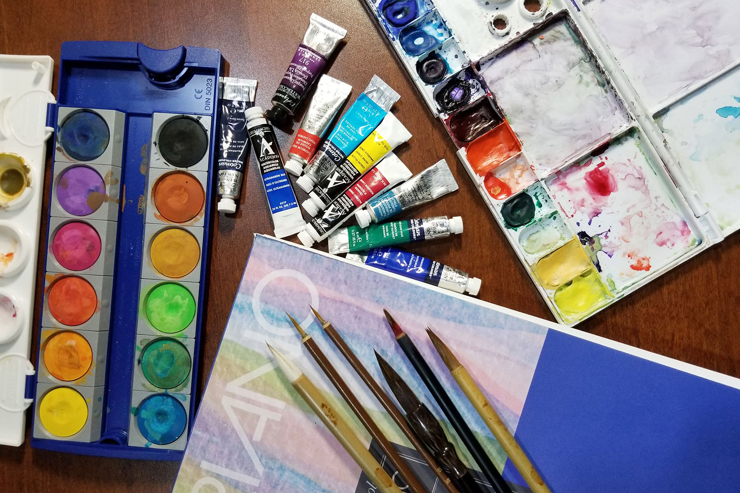
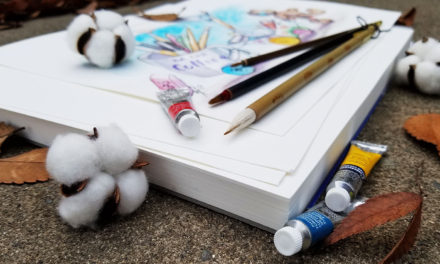
WATERCOLOR PAINTING SUPPLIES
• For watercolor painting, you will need watercolor paint, watercolor paper, soft brushes, and a paint well pallet tray.
• Additional supplies that are essential for working with watercolors are paper towels or an old cotton terry cloth that absorbs water well. Also, a container for water.
• Optional items you may find useful are masking tape, masking fluid, watercolor pencils, and a hairdryer. Also, a wood or canvas board big enough to tape your watercolor paper sheet to it.
This post may include affiliate links. Please read our disclosure policy. [art002]
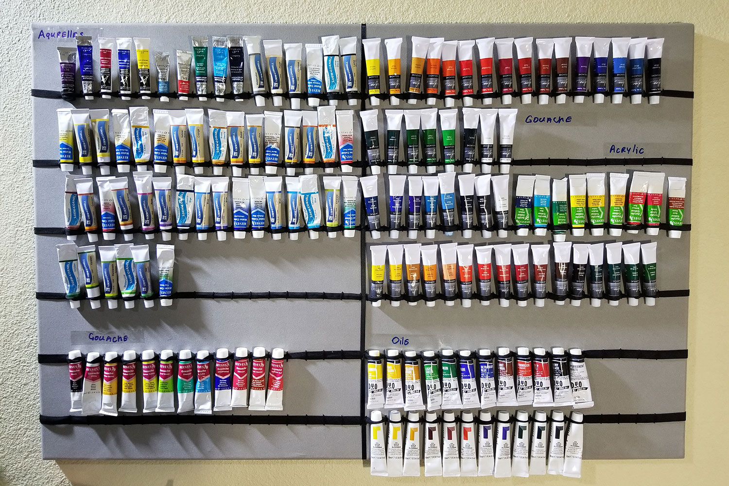
CHOOSING YOUR WATERCOLOR PAINT
There are so many brands out there that it’s very difficult to figure out which one is the best to get. Read through my suggestions below to learn which brands you will like best for your watercolor painting ideas.
There are sets, and there are individual tubes. You can start with any watercolor set of paint that you can find. Affordably priced art supplies can be found in many art stores.
If you are looking for decent quality and the most vibrant colors, I find brands such as Grumbacher Academy and Winsor and Newton work really great for me. You can find both of them in sets for a reasonable price on Amazon, or in art supply stores in individual tubes.
When searching for a nice, vibrant quality of watercolors that’s more budget-friendly, a set of Arteza Watercolors brand is the one for you. I am not sure which stores carry it, but you can find it on Amazon.
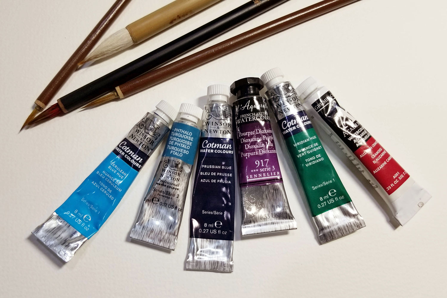
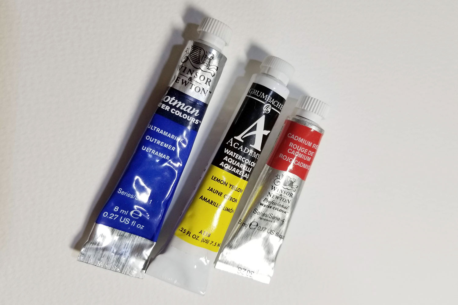
If you have decided to go with individual paint tubes, the colors you would need are the three primary shades – red, blue, and yellow.
I recommend getting Cadmium Scarlet, Lemon Yellow, and Ultramarine Blue. Also, a few other brilliant shades you may like to add to your pallet are, Alizarin Scarlet, Vermillion Red, and Medium Yellow. Prussian Blue, Cerulean Blue, or Phthalo Turquoise. Viridian Green, Sap Green, Burnt Umber, and Purple Dioxazine.
CHOOSING YOUR WATERCOLOR PAPER
Same as with watercolor paints, there are a lot of different brands and types of watercolor paper on the market. Cold press watercolor paper is more texturized and rougher. Hotpress is much smoother.
The best quality paper you will find out there are Winsor and Newton and Arches. But those can get quite pricey, as they are the finest quality.
The one that my college professor recommended for us is Fabriano Studio Watercolor cold press. It’s a good quality paper at an affordable price, which you can get either at art supply stores or on Amazon.
But if you are looking for something more on a budget, Canson Watercolor and Arteza are good choices to go with as well. They can be found in any store that carries art supplies and, of course, on Amazon as well.
As to what size of the paper you need, it is entirely up to you and your watercolor painting ideas. It depends on how big you would like to paint. I personally prefer the standard 9×12 and 11×14.
You can read my detailed Watercolor Paper Guide, where I explain differences in paper and how it’s used.
CHOOSING YOUR PAINT BRUSHES
To paint with watercolor paints, you will need a set of soft watercolor brushes. You can pretty much get a set of different sizes at any store that carries art supplies. Simply look for the name on the package that says watercolor brushes.
If, however, you prefer to purchase individual brushes, I have a few suggestions for you. I would go for round brushes, in the thin, long tip for fine outlines, and fine short tip for detailing. A medium round tip would be great for shading and the majority of the painting. And use ½-inch to 1-inch flat tip for large area coverage.
The reason why I recommend getting a set is that most of the sets have all those sizes included. You won’t need to waste time trying to decide which brush is the best to serve you in your watercolor painting ideas.
Another good set of brushes you may find useful are water brushes. Water brushes have a hollow handle and a tip that unscrews. It is designed to contain water inside the brush for watercolor painting and calligraphy purposes.
They are awesome because they contain water inside, making it much easier to keep your paints moist. This allows for easy blending and saves you multiple re-dipping times.
SETTING UP YOUR WORKSPACE
Before you start your painting, it is important to set up your workspace for easy use and less mess.
On your table/desk, you should have one sheet of watercolor paper, masking tape, a watercolor paint set, a container of water, paper towels or a rag, and a spare piece of paper for testing the colors and brushes.
I like to keep brushes standing bristles upward in a spare cup. That way, I can see all the sizes I have, and they don’t roll away from me.
Side note: Never leave your brushes soaking in the water container for a long period of time. The water will soften and wash out the glue that binds your brush bristles, making it fall apart over time.
PREPPING YOUR WATERCOLOR PAINT PALLET
Before you start out with your watercolor painting ideas, you need to prep your paint pallet.
If you are using a watercolor cake set, you don’t need to do this, because they are already pre-dried. All you need for that is sprit them a little with water, to get the pigment going.
As for the watercolor paint that comes in tubes, you will need to pre-dry them. For that, you will need to get yourself a paint pallet tray with small wells for your paint, and larger wells for mixing.
Simply squeeze out a decent amount of paint into the small well, in a color order that you see fit, and leave it to dry out. It usually takes from 12 to 24 hours for your paint to dry, depending on the brand. On hot days the paint can dry up as fast as in 4 to 6 hours.
STRETCHING THE WATERCOLOR PAPER
This technique is optional, but it is a great way to prevent warping of your paper when it comes in contact with water.
Using masking tape, (preferably artists masking tape since it’s less sticky and doesn’t ruin your paper) tape your watercolor paper to the wooden or canvas board, or any other one that’s water-resistant.
Make sure to tape as close to the edge as possible and very evenly. Watch so that you don’t take away too much of your paper unless you purposely want to create a nice border around your painting.
If you don’t have a board of any sort, you can tape your paper straight to the table. However, it will not allow you to turn your paper around as you work.
You don’t necessarily have to tape your paper down, but doing so prevents your paper from warping as you work with watercolors. It also helps your painting dry flat, giving it a more professional look.
If you didn’t tape your paper down, you can still more or less flatten your painting out by ironing it on a hard surface. Just make sure to cover it with parchment paper to keep it clean.
Other ideas include pressing the watercolor painting flat in between heavy books that are big enough to cover your entire painting. Leave it sitting there for a few days, for a better effect.
If you did tape your paper, do not take it off your board, until it is completely dry. If there’s even the slightest bit of moisture left, it will still warp a little, if you take it off of your board too soon.
LET’S GET STARTED
Now that your workspace is all set, it is time for the exciting part. You are ready to finally dip your brushes into those amazing, vibrant colors, and start painting.
But before we jump into anything, first, you need to get to know your colors. Learn how they apply to the paper, how dense their shades are, and how they work with and look on your paper.
Trust me, getting to know your paint colors is a really fun experience.
GETTING TO KNOW YOUR COLORS
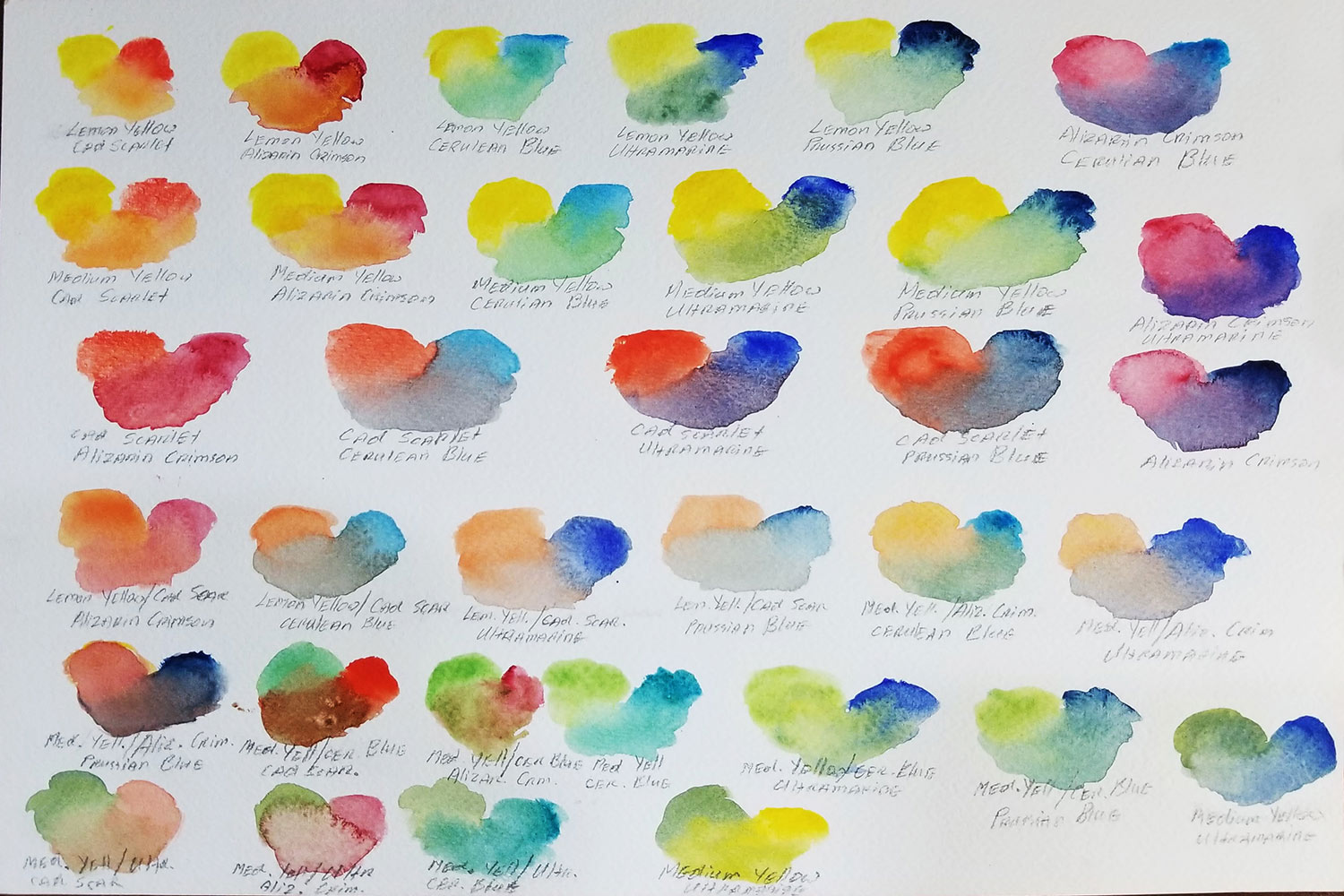
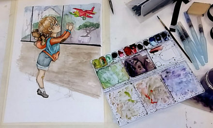
To get to know my colors better, I always like to create two types of color sample sheets for myself. One in blobs, and one in gradient strips.
To create the blob color sample, simply dab each shade of the color in nice size blobs. Then when it dries out, write the name of that color underneath it, exactly as it says on the tube.
This will help you remember which tube has which color and help you see how that particular color looks on paper.
For the gradient strips, first, create a small puddle of clean water on your pallet. Dip your brush into the plain water, and start painting your strip without any color just yet. Add just a little bit of color to your puddle, and continue painting the strip. Keep adding more paint until your puddle is now very saturated with color. But build up that saturation slowly and patiently.
Your strip should now have a beautiful flow of gradient color from light to dark. Do this with each color, and also write their names underneath it. This will give you a nice visual of how a different range of opaqueness and transparency work for each color of the paint.
I’m constantly testing how my colors have worked for me, and do this with every new shade that I add to my collection.
LEARNING HOW TO MIX COLORS
It is awesome when you have a set of watercolor paints, which offers you almost every shade imaginable. It sure makes things easier for us and lets us create paintings worry-free with more possibilities for watercolor painting ideas.
However, it is a neat little trick to possess, of knowing how to mix your own colors. Mix colors by using just the three primary colors yellow, red, and blue, during times when that’s all you’ve got to work with.
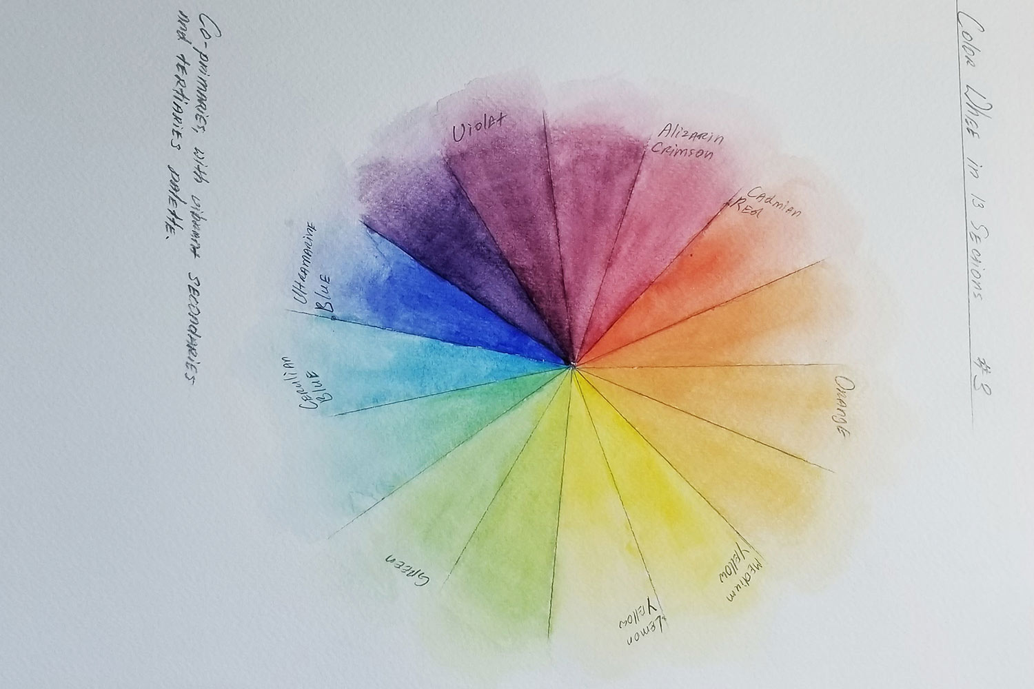
Learning how to mix your paint colors and remembering which color to blend with which to create a new color is actually quite simple. There’s a great scheme to assist you with that, called a color wheel.
Your color wheels can contain as many hue sections as you wish. Today, we are going to be looking at three types of color wheels: 6 hue-sections color wheel, 9 hue-sections color wheel, and 15 hue-section color wheel.
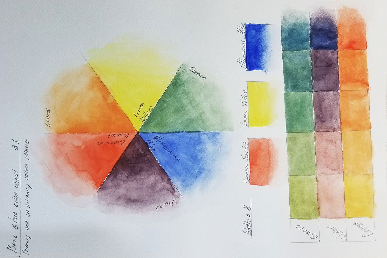
SIX HUE SECTION COLOR WHEEL
Six hue-section color wheel consists of primary colors and co-primary colors.
Primary colors are – yellow, red, and blue. Co-primary colors are green, orange, and violet. Those are the basic hues you get when you mix primary with primary in one to one portions.
Six section color wheel is there to help you remember which color to mix with which to get a specific hue.
To create your own color wheel, use a bowl or a small plate to trace a circle onto your watercolor paper. With the help of a ruler, draw six even dividing sections inside the circle, making it look like a pie chart.
Fill in three of the sections with your primary colors, red, yellow, and blue. Put primary colors into every other section, leaving a blank section in between each color.
The blank section is now to be filled with the child-color of the two tones it sits in between. For instance, the empty section that’s between yellow and blue will be filled with the shade you get from mixing yellow with blue together.
Now do that for each color. It is experimental, and so much fun. Once you are done, you should have your six-hue-section color wheel ready. You will have primary and co-primary colors in this order – blue, green, yellow, orange, red, and violet.
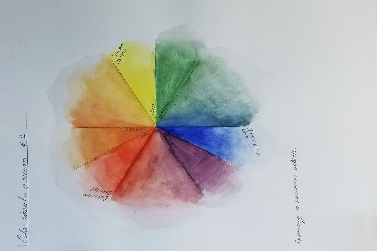
NINE HUE SECTION COLOR WHEEL
To create a nine section color wheel, draw a circle the same as in the previous example. This circle needs to be divided into nine sections, but we are going to be doing something different with it this time.
First, using a ruler, split the circle into six sections, just like for the first color wheel. Then, take every other section and split it in half. You should have a pie chart with three large sections, and two smaller sections in between each large one.
Then you will fill in the small sections with primary and co-primary colors in this order- blue, violet. Skip the large section and fill in with first red than orange. Skip another large section, and fill in two small ones with first yellow then green.
Now you have large blank sections sitting between the primary and co-primary colors – green and blue, violet and red, orange and yellow.
Yes, you have guessed it. That means the blanks will be filled with the child-colors of the two mixed colors in between which it sits. The sections filled with new shades are called secondary.
FIFTEEN HUE SECTION COLOR WHEEL
The fifteen section color wheel is the most fun one. Draw a circle on your watercolor paper, the same as for the previous two examples.
With the help of the ruler, split it into fifteen even sections, again, making it look like a pie chart. Then fill in every fourth section with your primary colors – red, yellow, and blue.
Now, the blanks in between each primary will be filled with shades you end up with by mixing the amount of primaries it’s closer to or further from.
For instance, take blue and yellow and fill in the blank sections that are closer to yellow with the shade you get from mixing more yellow and less blue. Then keep adding more of the color that you get closer to.
When you are done, you should notice a whole set of new colors appear on your color wheel such as teal, purple, pink, warm yellow, vermilion, and more.
Now that you are a bit more familiar with primary, co-primary, and secondary colors, do not stop there. I encourage you to take it further and start playing around with opposite colors on your color wheel.
For instance – blue and orange, or red and green. Start mixing those together to see what hues you will come up with.
I also recommend marking each color and shade for personal reference. Trust me; it will come in handy as you embark on the journey of a painter.
Creating your own color wheels will help you understand color a bit better, and teach you about color theory. You will understand how certain shades are achieved and how different colors work together.
When painting with any kind of paint, artists have to mix colors all the time. It is a nice trick to have up your sleeve when you dive into the world of art.
BASIC WATERCOLOR PAINTING IDEAS & TECHNIQUES
There are many different techniques you can apply when painting with watercolors. Using sponges, salt, and rubbing alcohol helps artists to achieve interesting textures and effects.
I am going to introduce you to a few very basic painting techniques that are very handy for creating beautiful works of art.
DRY ON DRY
The dry on dry technique is excellent for small details and fine lines. Keeping your paper dry, make sure your brush has very little water and is almost dry too. Dip it into your paint, and start painting.
I use dry on dry method for sketching the base of my painting, using very light shades of color. Then I love to apply this technique to get the most of the fine detailing in my work.
WET ON DRY
Wet on dry is a basic technique everyone uses to paint with watercolors. It works well for filling in with colors, blending, and shading. Also, to create a gradient and building up the color.
It is also great for painting precise shapes without having your colors bleed together. Wet on dry technique is achieved by using a watered-down color and quite moist brush, on a dry paper.
WET ON WET
The wet on wet technique is mainly used to achieve beautiful and flowy shades when working with landscapes. This painting method works especially well on skies or for covering large areas with color.
For this technique, you apply wet paint to a wet surface.
There are many ways to work with this technique. First, you need to get your paper ready. You can either soak your entire watercolor paper in water for thirty seconds or just apply a decent amount of clear water to some sections, allowing it to be absorbed by the paper.
Then, using a large brush and watered down paint, start painting, and watch your colors flow.
DRY ON WET
Dry on wet is pretty much more controlled version of wet on wet technique.
Using a slightly damp brush, simply apply your color to the wet paper. Still keeping the colors flowy, it gives you more room for finer details and shading.
This technique is also mostly used on landscapes to create the outline of shores and nature.
PLAYING AROUND WITH OTHER TECHNIQUES
Those are a few basic techniques always present when painting with watercolor paints. However, there are few other techniques you might find fun to play around with.
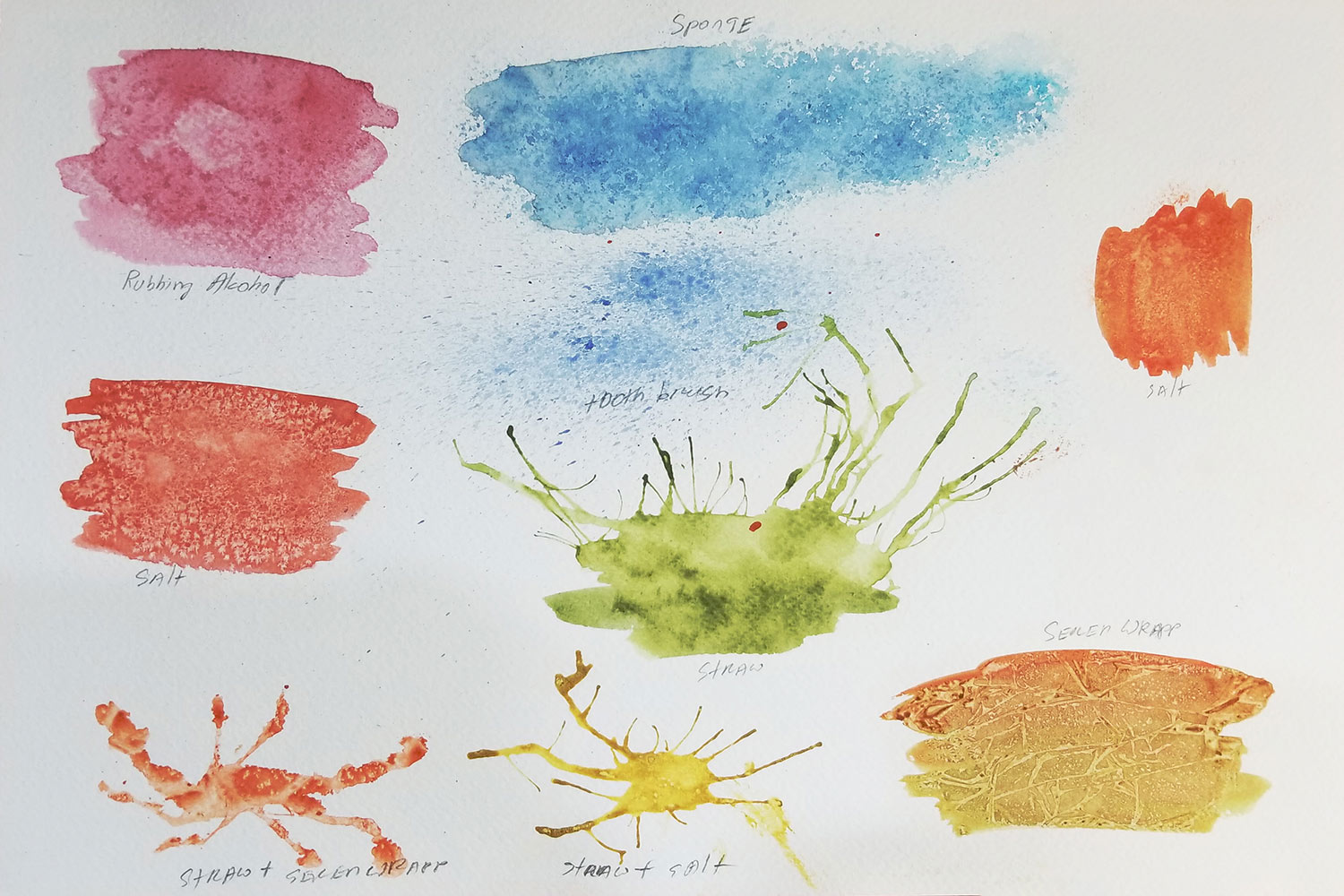
SPONGING
Instead of a brush, dip a piece of sponge into your watered paint, and gently dab onto your paper.
Dipping your sponge into two different shades – for instance, light green and dark green – will help you create bushes and greenery.
SALT
Using wet on dry technique, cover a large amount of surface with color. Make it very opaque. You can even mix a few different shades for a more interesting effect.
While your painted area is still wet, sprinkle a little bit of salt on it, and set it aside to dry. The water will dissolve salt crystals, making the mineral in them push the pigment away, creating a star-like or frost effect.
RUBBING ALCOHOL
For this technique, mix half rubbing alcohol and half water into a spray bottle. Apply a wet, opaque amount of paint onto your surface. Then, lightly spritz it with a water-alcohol mix. Watch the pigments react to alcohol, creating an effect of exploding galaxies.
You can even use perfume techniques. Not only will it work just the same, but it will also make your painting smell good.
STRAW
On your paper, create a very wet puddle of diluted paint. Take any straw and start blowing at the puddle, creating a spilling effect. You can control the flow of your paint.
This interesting technique can come in quite handy when painting a tangled bush, or branches. Then, you can use a sponging method to give them some foliage.
CONCLUSION
There are many different ways to work with watercolor, and each artist finds what technique works best for them.
Therefore, I highly encourage you to experiment. It can be great fun. Don’t be afraid to try new things and step outside your comfort zone to try different watercolor painting ideas.